BREAKFAST POINT COLOUR
This Breakfast Point home was reimagined for a wonderful couple in a later stage of life, ready to move beyond a safe, beige-on-beige interior and embrace something far more expressive.
The brief was simple: introduce colour, personality, and a renewed sense of energy—without losing the comfort of home.
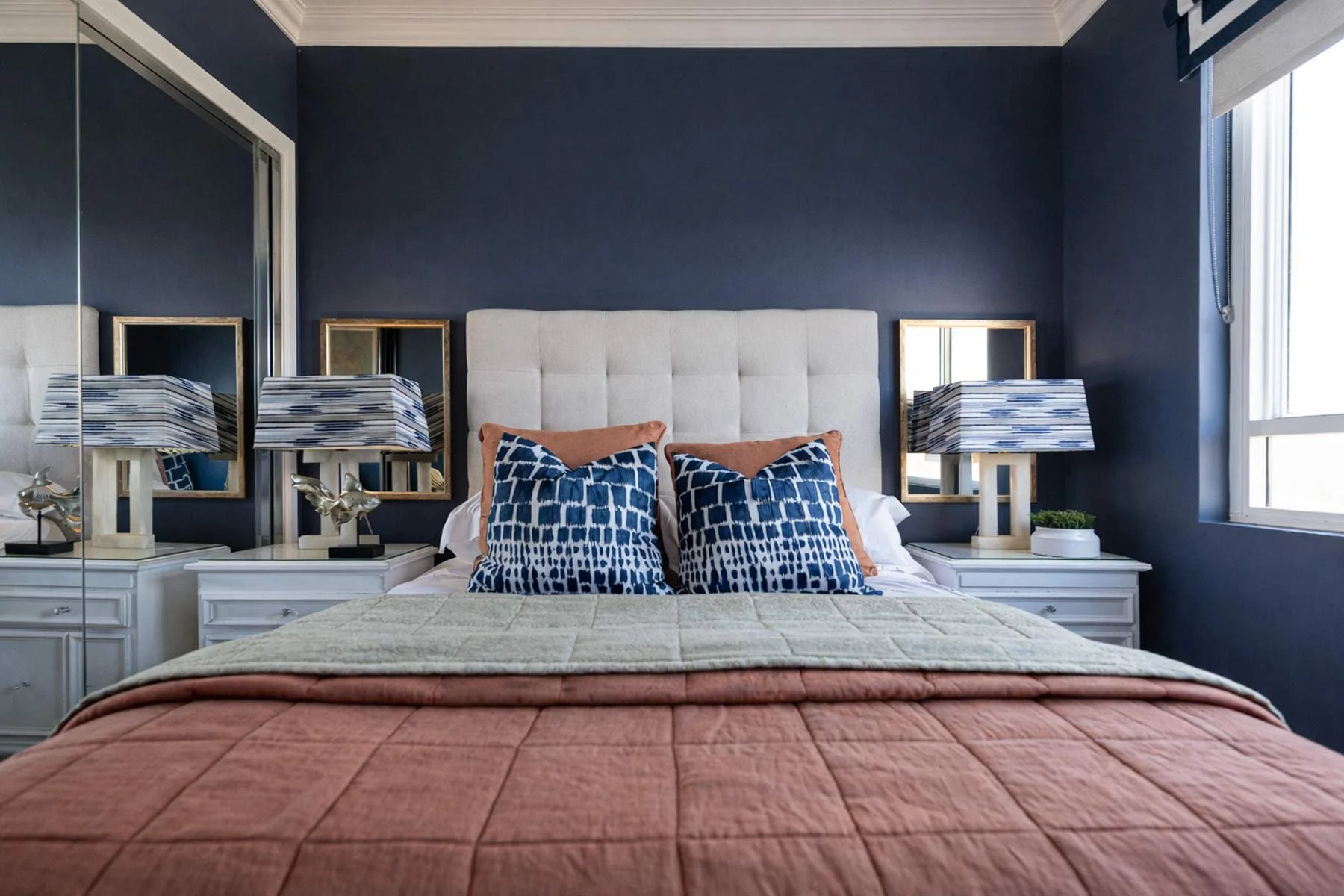
A bold shift came through the use of Porter's Paints Antique Blue across the main living area, extending into the guest bedroom and study to create continuity and depth. Existing vintage pieces were reinterpreted through the introduction of layered floral and paisley fabrics, giving them a fresh relevance within the updated scheme.
The result is a confident, colour-driven home that feels both elevated and alive—transforming what was once a washed-out interior into a space full of character, warmth, and inspired conversation.
Photographer: Yie Sandison


DESIGNER’S NOTE