CUT THE CREAM! A HOME REVIVED BY COLOUR

I remember the first time I met the owners of this apartment. The home was located in Sydney’s Breakfast Point, with a view from the balcony showing the best of Sydney’s sunshine and water. The view was sunny and bright, but the current decor? Not so right!
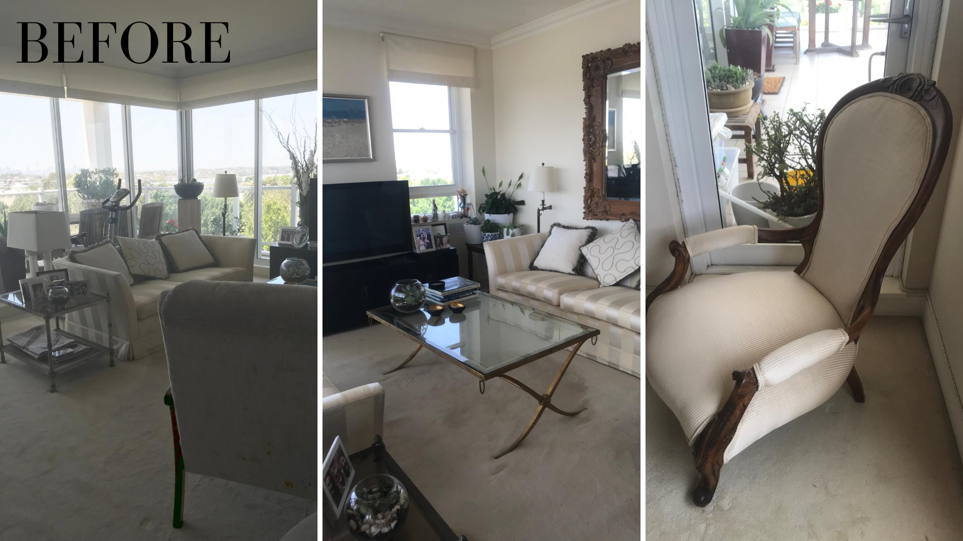
My clients were the most lovely couple, and were ready to push the start button on re-decorating their home, which was primarily filmed with cream on cream and.. more cream! The first thing I wanted to do was give some life back to the apartment by adding pattern and colour. These digs were crying out to celebrate its surroundings in a far more fun & far happier way and I was pleased to be asked to begin.
The clients are carpet people, so the flooring was to stay as is. In terms of furniture, you can see we had occasional chairs, pillows, walls, pretty much everything in the one monotone colour of cream. Check out the below images to see where we began.
FIRST STEPS : CUT & CULL
I think it’s always a great idea when re-decorating to think about what you can move on or donate. It’s an excellent time to re-assess what you have and clear out some of the items or pieces you really don’t need anymore. I encourage moving on anything that is confusing or cluttering up a room.
Once this process is completed, the floor plan is simplified, and we can start to map out a revised version with a clearer head. I found that there were a few little areas that were be being overcrowded with ‘stuff’. Above, you can see numerous floor lights and table lamps placed around the room, with the scale of the pieces not quite fitting the location. There were too many photo frames on the entertainment unit as well as places where we mostly just want a place for a cup and saucer and not much else. There was an exercise bike in the living area. There were plants on trays in a corner, and although it’s wonderful to be living in a green environment, it was having the opposite effect and adding congestion to the room.
I consider my way of decorating to be ‘maximalist’ in courage and colour, but that doesn’t mean maximal clutter. It’s the first thing I assist clients in managing so we can start the new project without baggage and confusion. I do it with love, and the idea is that much of the time clearing out and clearing up provides a sense of relief and contentment.
NEXT STEP : COLOUR INSPIRATION
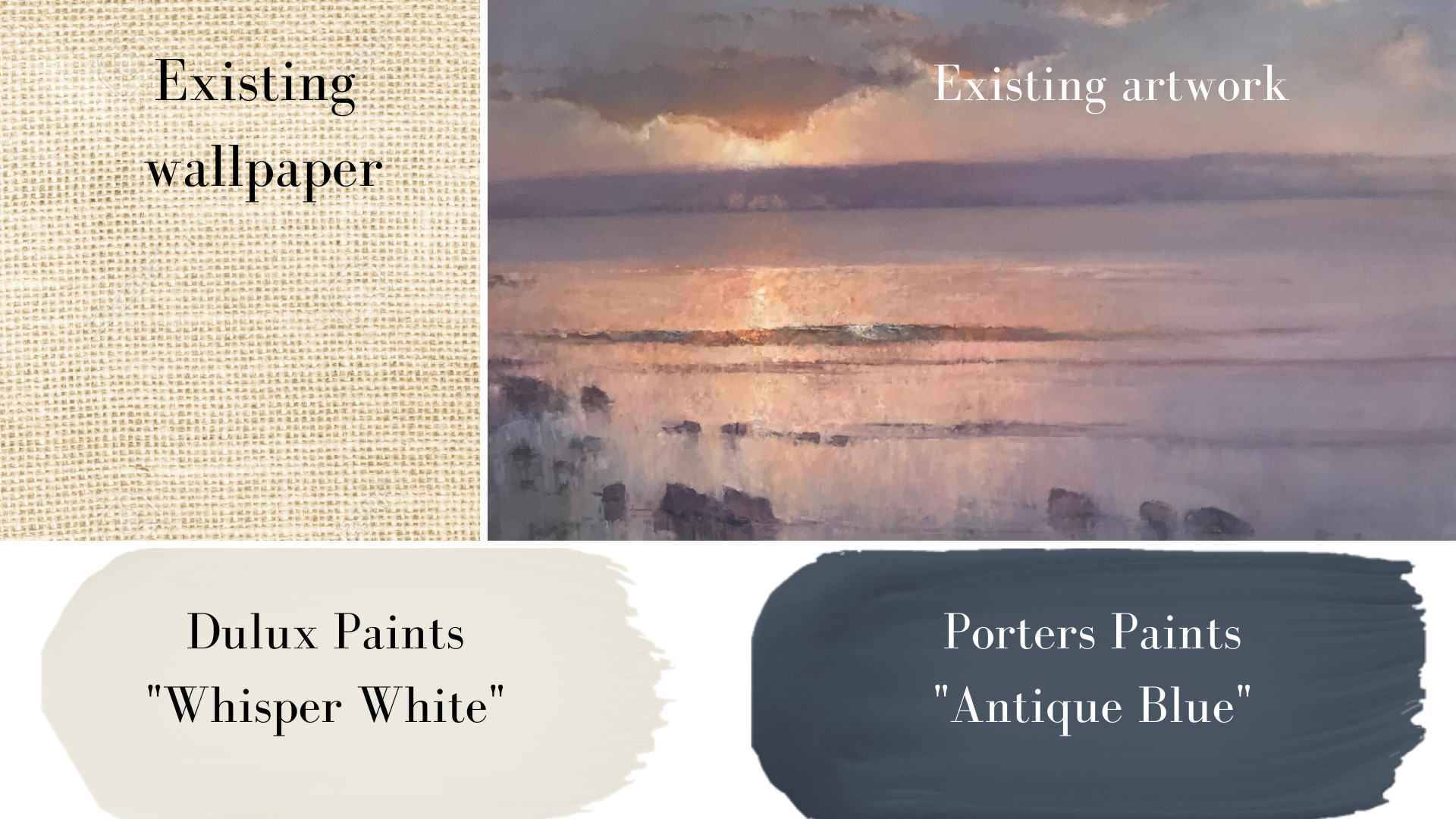
The rule of thumb in any home is you that must work with the things that you want to keep on show, or finishes that you can’t or won’t change. The muse for this project [because it was staying in the open plan living area] was an existing piece of art of a horizon with violet and gentle sunset pinks. Using green based blue for my feature colour was not going to be the right selection, I needed to ensure it was a red based navy. So, voila! Porters Paints’ ‘American Navy’ came to the party and created the kickoff point for the rest of the apartment makeover.
I was also working around existing walls covered in a textile wallpaper that was yellow/cream based, so the colour I chose for the new white walls we were painting had to have a yellow base to it. I selected ‘Whisper White’ from Dulux, for its slightly warm, creamy undertone. I wanted to make sure the newly painted neutral areas were a warm white as opposed to buttery yellow, so Whisper White was the perfect choice here.
CREATING THE MOOD - OPEN PLAN LIVING AREA
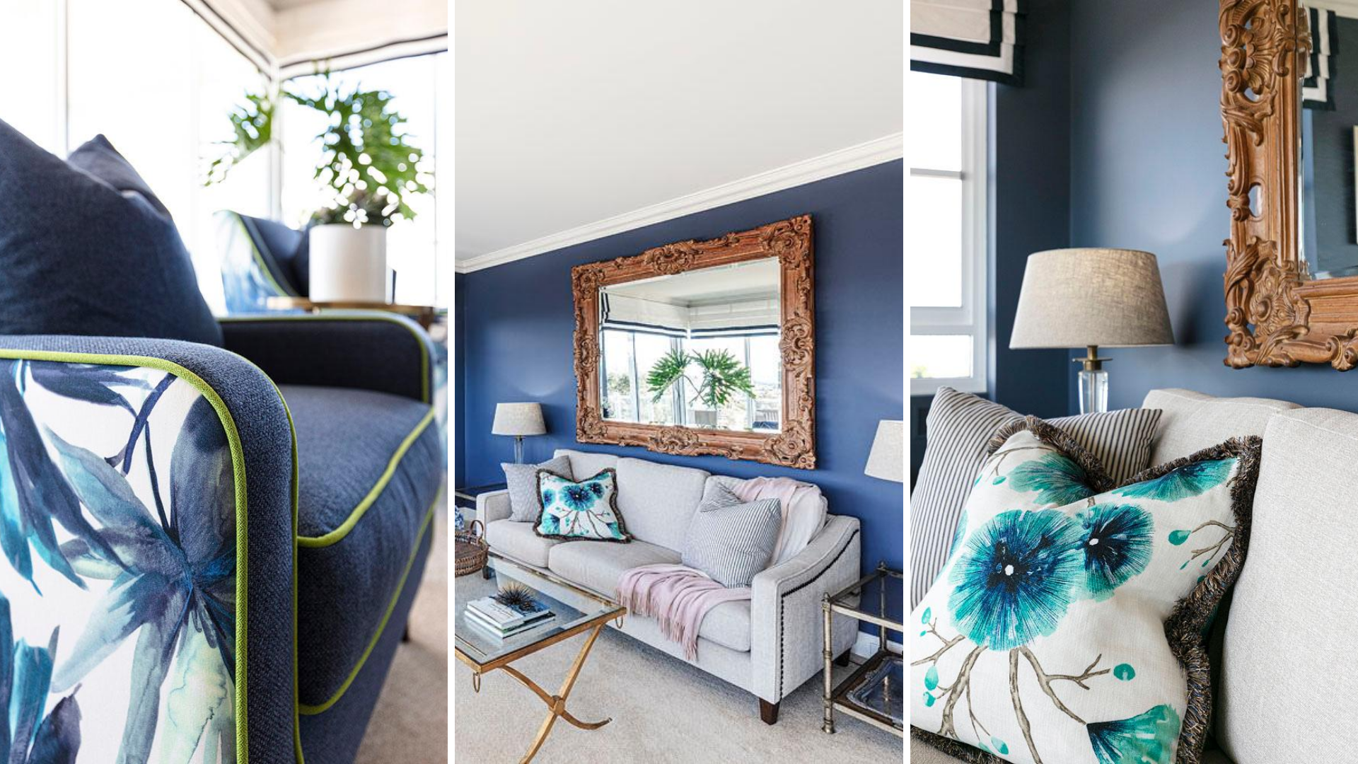
I started by pulling fabrics. The client still wanted a cream sofa and carpet [which incidently had to be replaced mid project due to a washing machine burst], but were open to a little pizzaz, so I went for it. I wanted to add some lively botanical pattern [as I was clearing out some of the plant life in the carpeted lounge area] into the new pieces. I chose to keep the new three seat sofa neutral, but infused wonderful character with two new occasional chairs that I would custom make for this project.

Below, you can see the after results. I love how the occasional chairs turned out so beautifully, really hitting the mark. The punchy fabric “Shangri-La’ in Sapphire looked amazing with the bright green ‘Cactus’ piping in a subtle herringbone pattern. The chairs made a huge impact and look stunning in the home. The sofa was covered in a hard-wearing performance fabric [grandchild proof!] so it was easy to clean, and the custom cushions added the finishing touch. I had to change out the bobble fringe on our feature cushion as it was out of stock, but really like the gold frilled alternative selected in absence of the bobbles!
As you can see, the couple’s large Balinese mirror stayed, and I just think the warm wood looks so much more impactful against the Antique Blue than bare white. What do you think?
GUEST BEDROOM
I was also asked to makeover the guest bedroom, which was white and cream and thats about it. I thought it would be great to paint out this room in the Antique Blue to make a grander statement. Have a look at the individual pieces in before mode, and see how this room changed. Quite remarkable!

And below is the after! I think it’s made a huge step forward, and luckily my client’s agreed! I transferred a couple of the shorter table lamps that were in the main living area and swapped them out with the taller ones that were originally in this guest room. I recovered the shades in a smart fabric giving the shades new life. I love the horizontal lines running through them in our complimentary colour way. You can also see the new mirrors I added behind the lamps to give more depth to the room. The existing bedhead remained, but the contrast between the lighter fabric and the darker walls became [again] much more interesting. I re-covered the couple’s antique chair from the 1800’s in a lovely Sanderson fabric which worked beautifully with the walnut warmth of the existing wooden frame.
Another feature I added was new pelmets to all windows. You can see in the guest room, that the new ones I custom designed now have fresh white fabric with a navy banded detail. These were installed in the bedrooms and main living areas and were a real contrast. They turned out looking absolutely amazing!

A MINOR KITCHEN MAKEOVER
I was surprised when my client wanted a slight refresh of the kitchen as opposed to a complete renovation. Normally people want the full kitchen reno and look at any remaining investment dollars available to decorate after the reno work. This time it was the opposite! We ‘de-creamed’ the kitchen by just painting out the existing lower cupboards in Antique Blue. The upper cupboards were painted in the Whisper White, and the backsplash was replaced with Antique Blue glass instead of the subway tile. Granite Transformations were able to provide a new benchtop without ripping out the existing one and the client incorporated new internal storage drawers with the assistance of a local tradesman. This minor refresh really tidied things up and didn’t cost anywhere near what it would have cost to renovate.

And there we have it! I hope you loved the transformation of our latest Breakfast Point project! We look forward to doing more in this lovely suburb in Sydney.
Would you like to talk about your decorating or renovation project? If so, I’d love to talk with you! Jump on my calender here for an obligation free chat.
AS