POWER SESSION PROFILES: KAT & EDDIE
This week, I thought I’d share a little detail on a new interior scheme I created remotely for one of my Two Hour Power Session client’s Kat & Eddie. Kat and Eddie are a successful couple with a young family, but had gotten bogged down in the functionality of their furniture and colour choices. They were also planning to renovate their existing kitchen and were confused on the stone to use and the new colours to introduce.
What is great about my Two-Hour Power Package is that the client gets ten punch items that I guarantee to address in our time together, and in their follow up report. I was able to pull together the key kitchen finish decisions the couple had to make, as well as assist them with other rooms they were struggling with all within 48 hours from our session together.
Here’s how the process worked for Kat and Eddie, and details of those important design dilemmas that were solved in our time together.
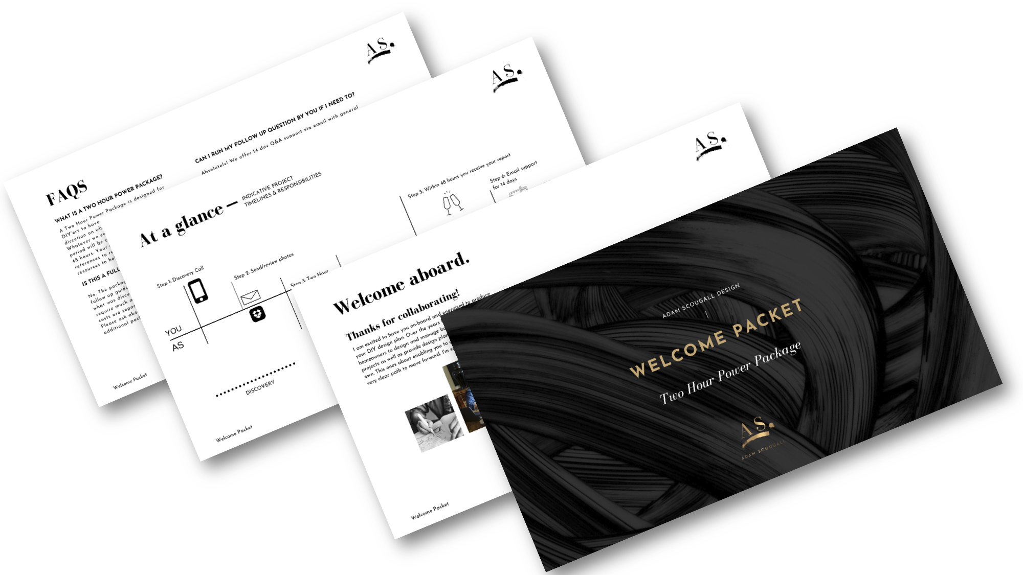
Step 1: As always [and for every client] we jump on a discovery call and assess the right fit in terms of service. Kat & Eddie were definitely DIY’ers so the Two Hour Power Package I knew was going to suit them perfectly. I send through the client Welcome Packet that helps recap the process.
ABOVE: The Welcome Packet recaps and clarifies the process further.
Step 2: Kat sent through her before photos as well as inspirational images. This helps me prepare for our session in advance, as well as get a clear idea of what the guys aspire to in terms of their ultimate style. They also completed the ‘Become A Client’ questionnaire here on the website, so I know what the ten punch items are going to be, as well as their overall design dilemmas.
ABOVE: The client is asked to provide before images prior to the session, as well as a completed brief and inspiration photos to reflect their true style.
Step 3: We completed our online consultation [two hours] and I got to work putting together their package. It was great that the guys were able to share further detail about the rooms via video during the call as well. It’s always a fun and collaborative experience!
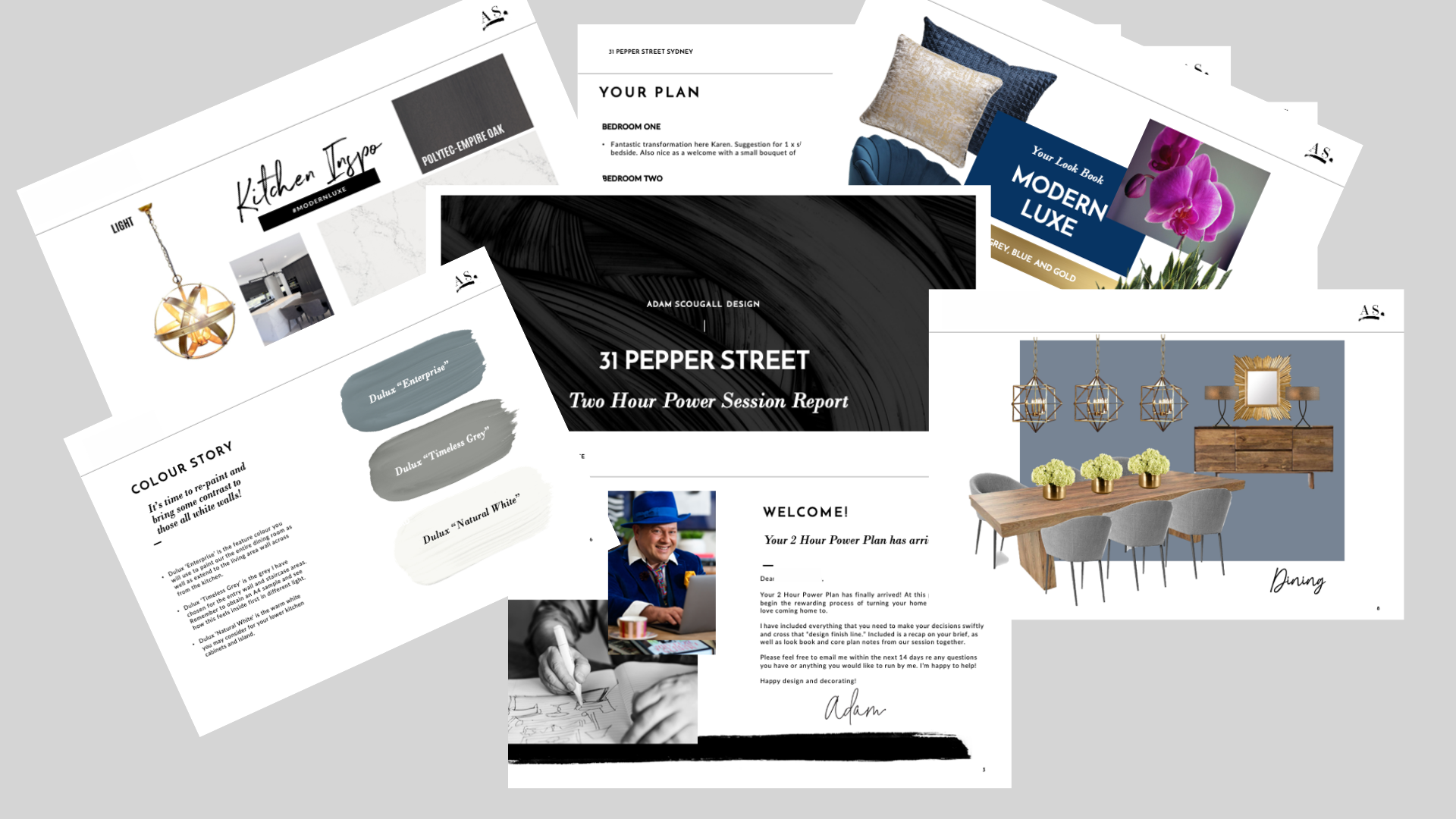
Step 4: Within 48 hours the completed package was issued. I wanted to make sure Kat & Eddie had the visuals they needed, so the three mood boards in the ‘Look Book’ section that came with the package helped to clarify this clearly.
The guys had all white walls [more a cream than true white] so we needed to add some sophisticated colour into the mix. I chose Dulux ‘Enterprise’ for the dining and one living area, with the gentle ‘Timeless Grey’ to be used in the entry to provide more of a dynamic feel.
I also made sure the guys had their main selections selections sorted for the finishes in their soon to be new Kitchen. Although they had not completed the design, we were able to provide them with the Caeserstone selection [‘Empira White’] a wood -look veneer by Polytec detail for upper cabinets [‘Empire Oak’] and the Dulux colours to use for their polyurethane cupboards.
Suggestions were also made for pendant lighting and breakfast bar seating. See the mood board below.
ABOVE: The kitchen mood board with specific finish details helped the couple make the decisions that they had ben confused about for weeks.
ABOVE: The completed Power Package is emailed through within 48 hours from our session.
Step 5. The 14 day follow up
As always, Kat & Eddie have 14 days follow up support for the package. It helps them to ask questions after they have had time to process. We need to process the details for a while and have the ability to seek clarity. I always want to make sure my clients get a reasonable time to do this to avoid any un-necessary concerns they may have after the process is completed.
Do you feel like you would benefit from the same process that Kat & Eddie have? If so, feel free to jump over to see further details of the package here for further information and schedule a call here on my calendar.
AS


